Bridge City Poker | GRAPHIC DESIGN & PRODUCTION
Bridge City Poker is a simple card game inspired by Japanese style trick taking games, created by a Portland-based card game producer. I collaborated with my partner, Caleb Sohigian, to create a minimalist product which combines dynamic illustrations of Portland bridges, unique typography, and bright colors to make the game pop on the shelf and on the table.
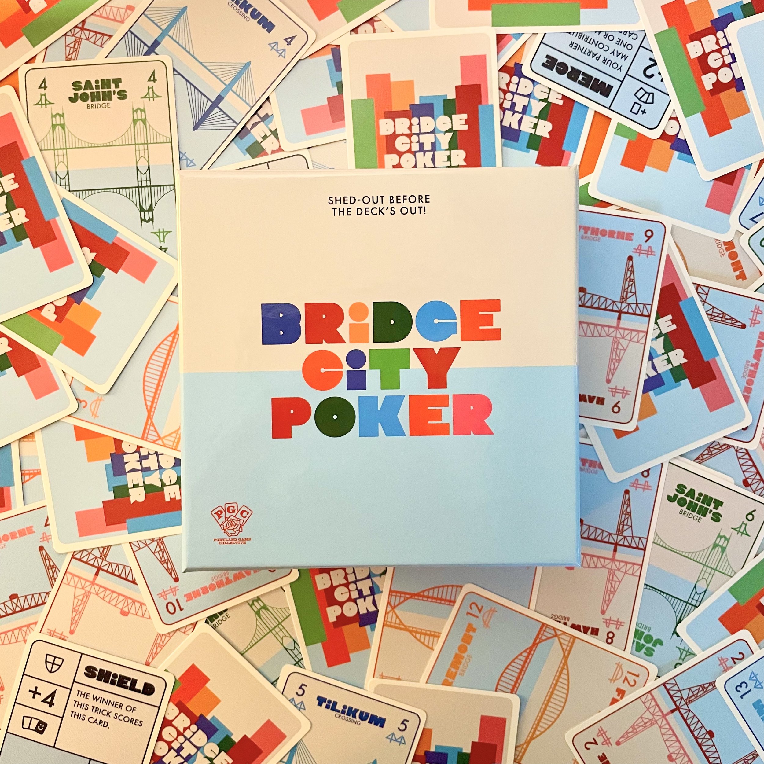
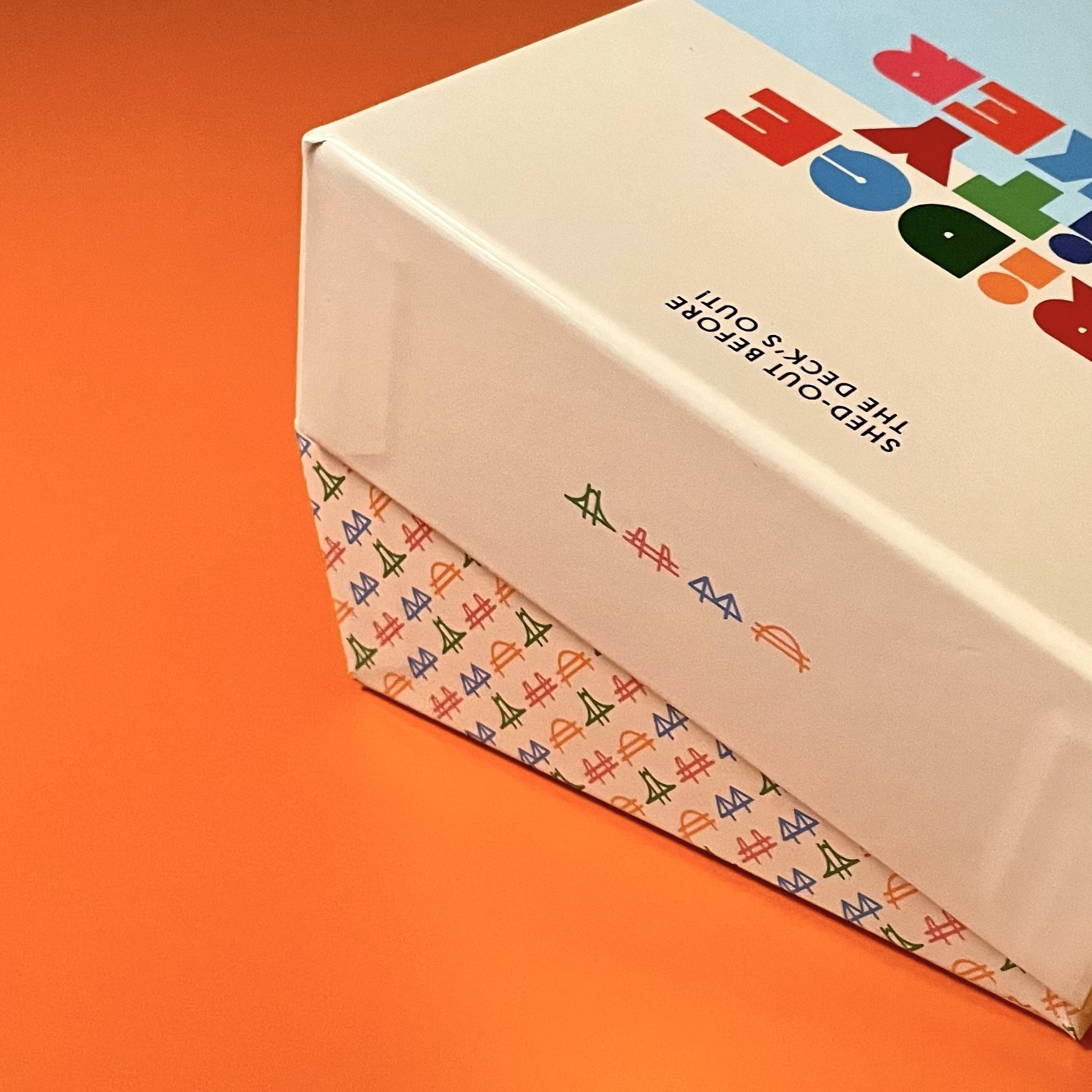
Thoughtful Packaging
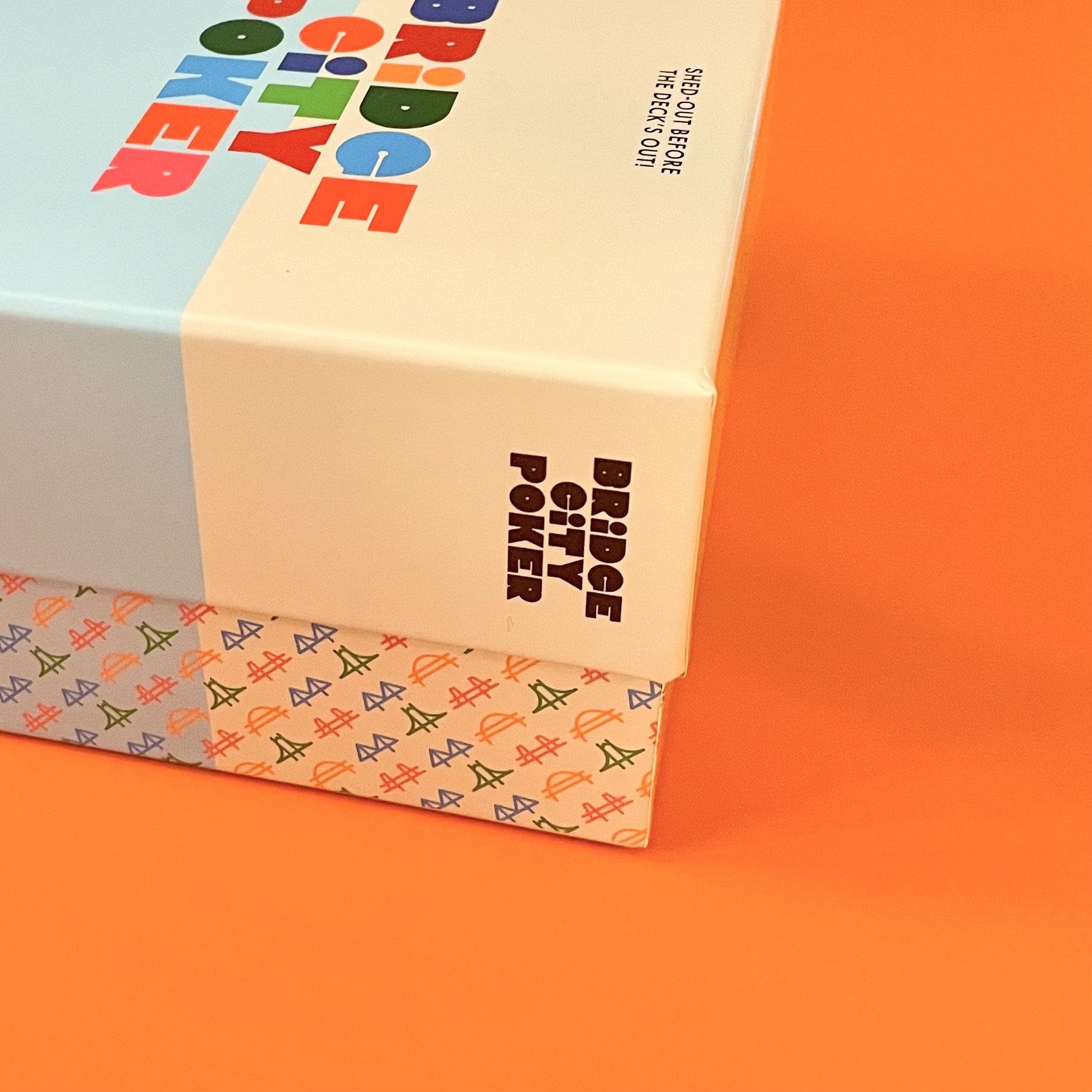
Many games go for a maximalist approach in their box design, trying to display every element of the game. In order to stand out, we decided we wanted to go as minimalist as possible, mirroring the elegance of the game itself.

Dynamic Layouts
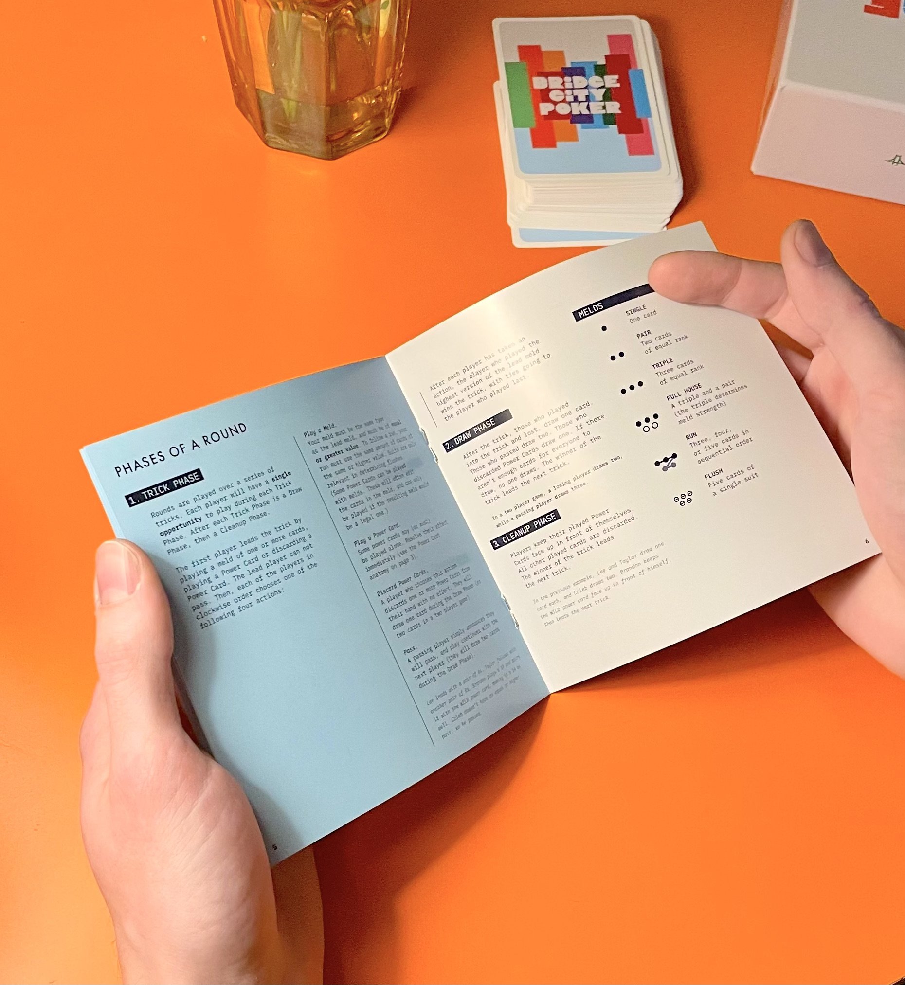
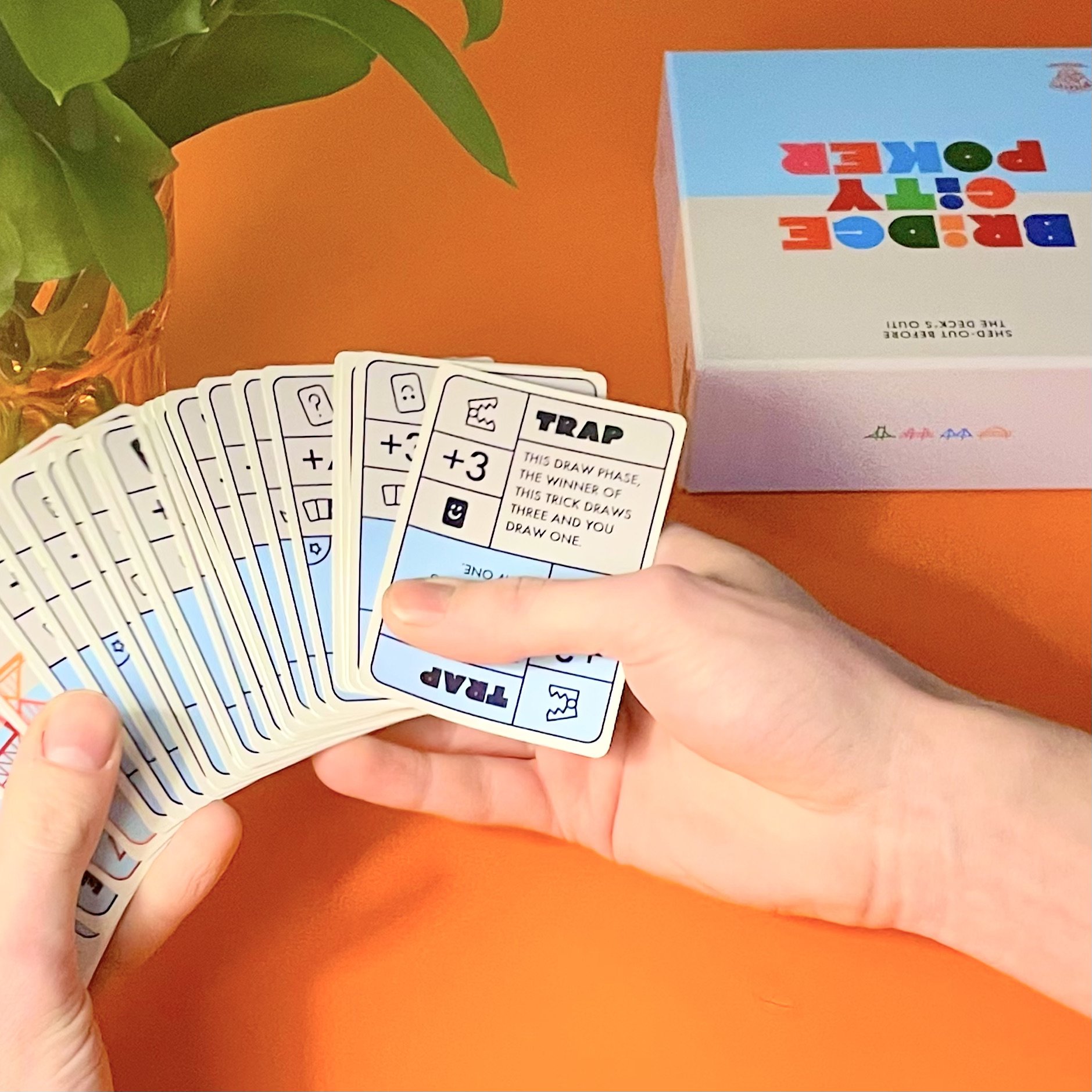
This game has many cards with tricky to communicate effects. We created an elastic template that was robust enough to hold a wide range of icons and text, while coexisting with the clean aesthetic of the core bridge cards. The font choices and icon designs helped to keep the presentation expressive and engaging.

ILLUSTRATION
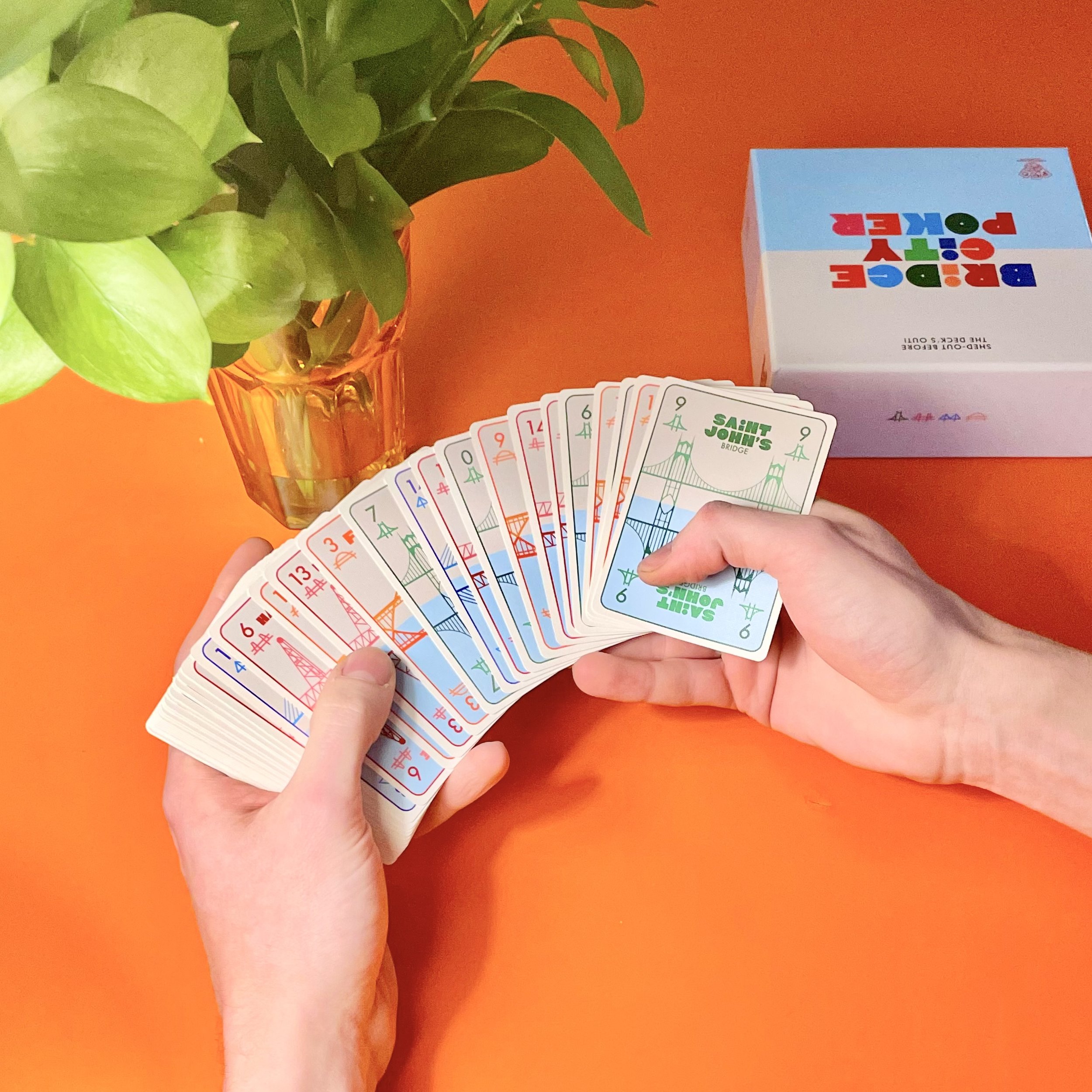
Bridge City Poker’s design includes illustrations of all the iconic bridges that Portland is known for. It was important to us that the bridges were identifiable while also being sleek and simple.

Smart Approachable Design
As avid board gamers, it was an important and exciting challenge to take a big and complex game and make it feel simple in the design. Board games should be clear, inclusive, and exciting. We believe we achieved that in this project.